Nidhi Dali
Home
Redesigning a request tracking page to help users filter, find, and manage requests efficiently
Role - Sole UX researcher and UI/UX designer
Design Process - Double Diamond
Discover → Define → Design → Deliver
Industry - Insurance
Discover
Define
Design
Deliver
*
*
*
*
The Starting Point
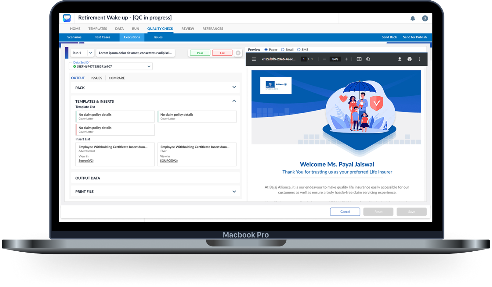
UCH helps large enterprises manage and deliver communications like policy documents or customer letters, with each “pack” representing one such communication.
Before delivery, packs are tested with multiple XML files using an internal tool called Mission Control, to ensure things like customer numbers and page layouts appear correctly.
During a busy customer onboarding phase, with limited design resources, some features were built directly by engineers using design system components. One such update — the multi-XML testing flow in Mission Control — was shipped without UX input. Though functional, it confused users and triggered the need for a complete redesign.
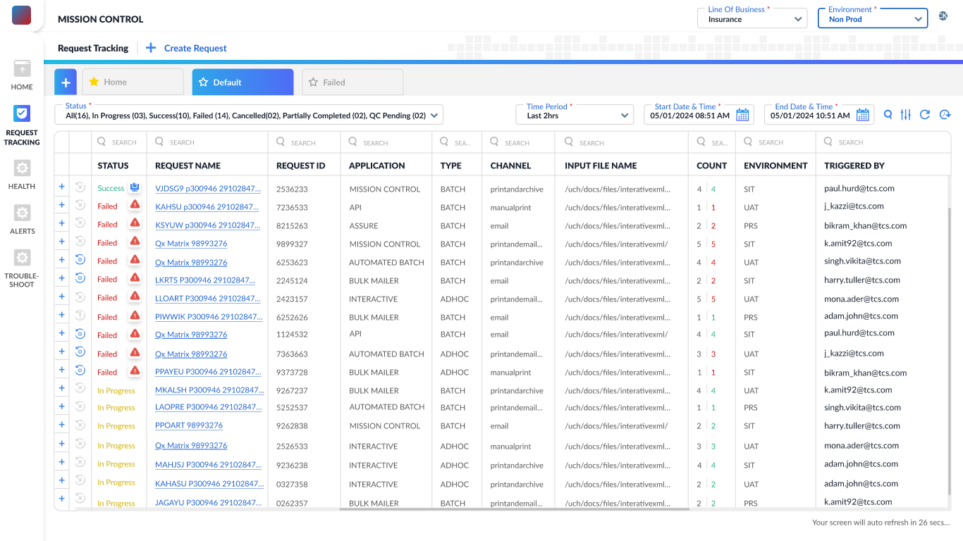
In my initial discussions with the product manager, operations team and engineers, I learned that users were struggling to navigate and make sense of the request tracking screen. The interface was functional but lacked clarity — it had no filters or sorting options, making it difficult to locate specific requests, especially in long lists.
Request tracking screen developed by the engineers using
design system components
Insights from team discussions
My hypothesis based on the old design
Usability Testing
- Users struggle to locate specific requests due to the absence of filtering, sorting, and pagination controls. With no way to view result counts or narrow down entries by time, status, or channel, navigating large volumes of data became time-consuming and frustrating.
- The interface doesn’t allow users to group or collapse requests by type, trigger, or application. Additionally, actions like retrying failed requests or viewing more details require navigating away, disrupting the workflow and increasing user frustration during bulk testing.
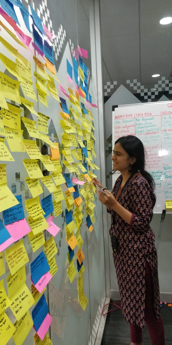
On the basis of the insights I had gathered from team discussion and for concluding the hypothesis, I proposed Usability Testing. 5 participants from program/customer team were nominated for this. Below is an overview of the observations from the same.
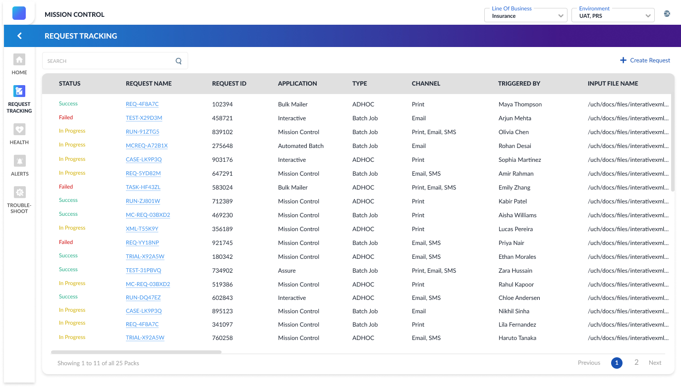
1. Users were unsure what the status color codes meant.
Many users hovered over or clicked on the “Status” column expecting more information.
2. Search was ineffective due to non-memorable request names.
Participants were unable to retrieve past requests unless they had copied the request name elsewhere.
3. Lack of filters increased time spent on finding relevant data.
Users expected to filter requests by status (e.g., only failed ones), date/time, or trigger type but couldn’t.
4. No feedback after triggering a request left users confused.
After creating a new request, users were unsure if it had been submitted successfully.
5. Users didn’t know how many total requests were triggered.
Testers mentioned needing a count of how many requests they ran in a session.
“Where’s the filter? I just want to see the failed ones — scrolling through all of this is too much.”
“Wait, how many requests have I even run? There’s no count anywhere.”
“I was expecting a success message or something after I triggered a request — it just disappears.”
-- 100% of the Testers
-- 70% of the Testers
-- 60% of the Testers
*
*
*
*
Discover
Define
Design
Deliver
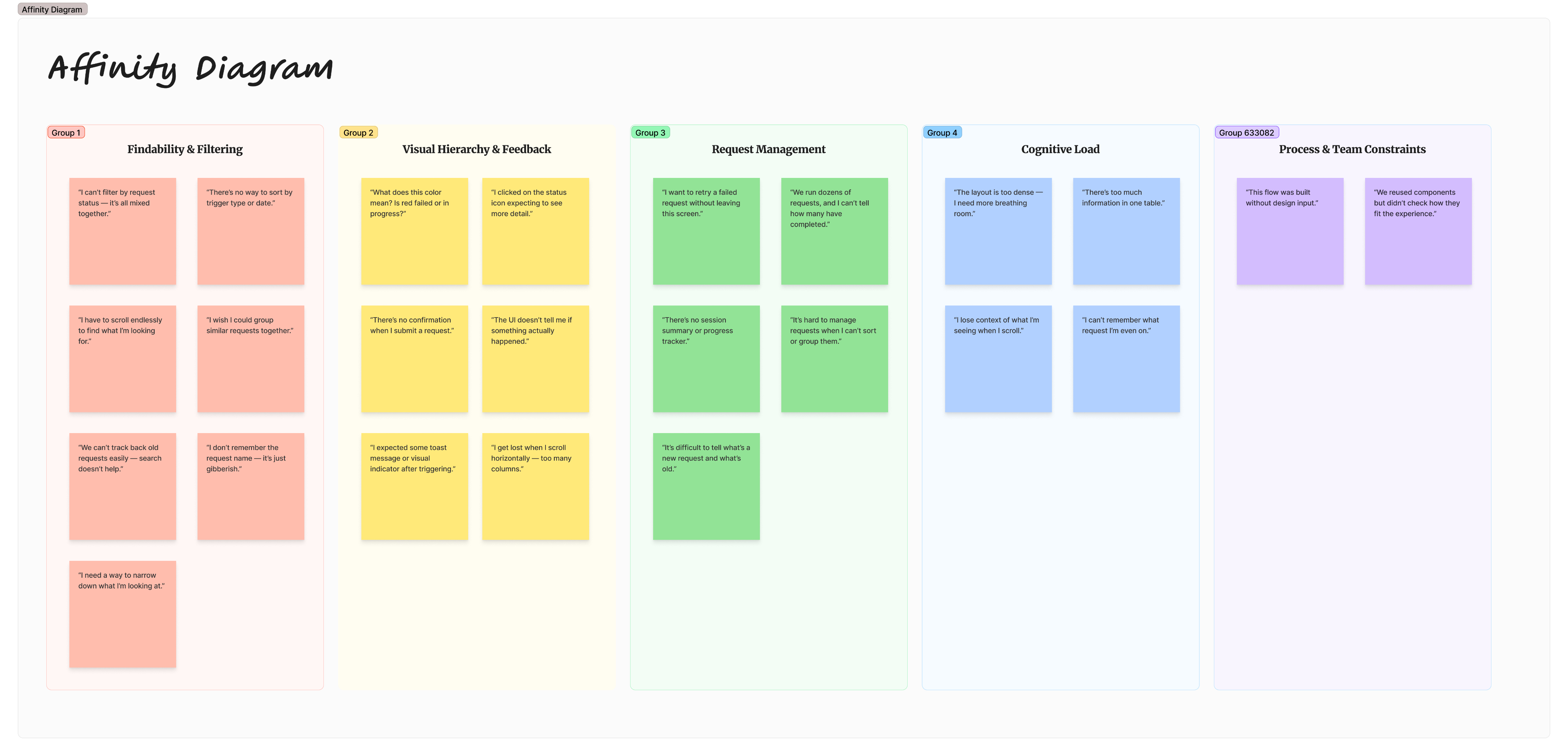
I used Affinity mapping to synthesize the research I had conducted—which included conversations with the product manager, operations lead, and engineers to understand customer concerns, as well as usability testing and observation logging.
This helped me organize and make sense of the diverse insights gathered, identify recurring themes, and uncover key user pain points that would shape the direction of the redesign.
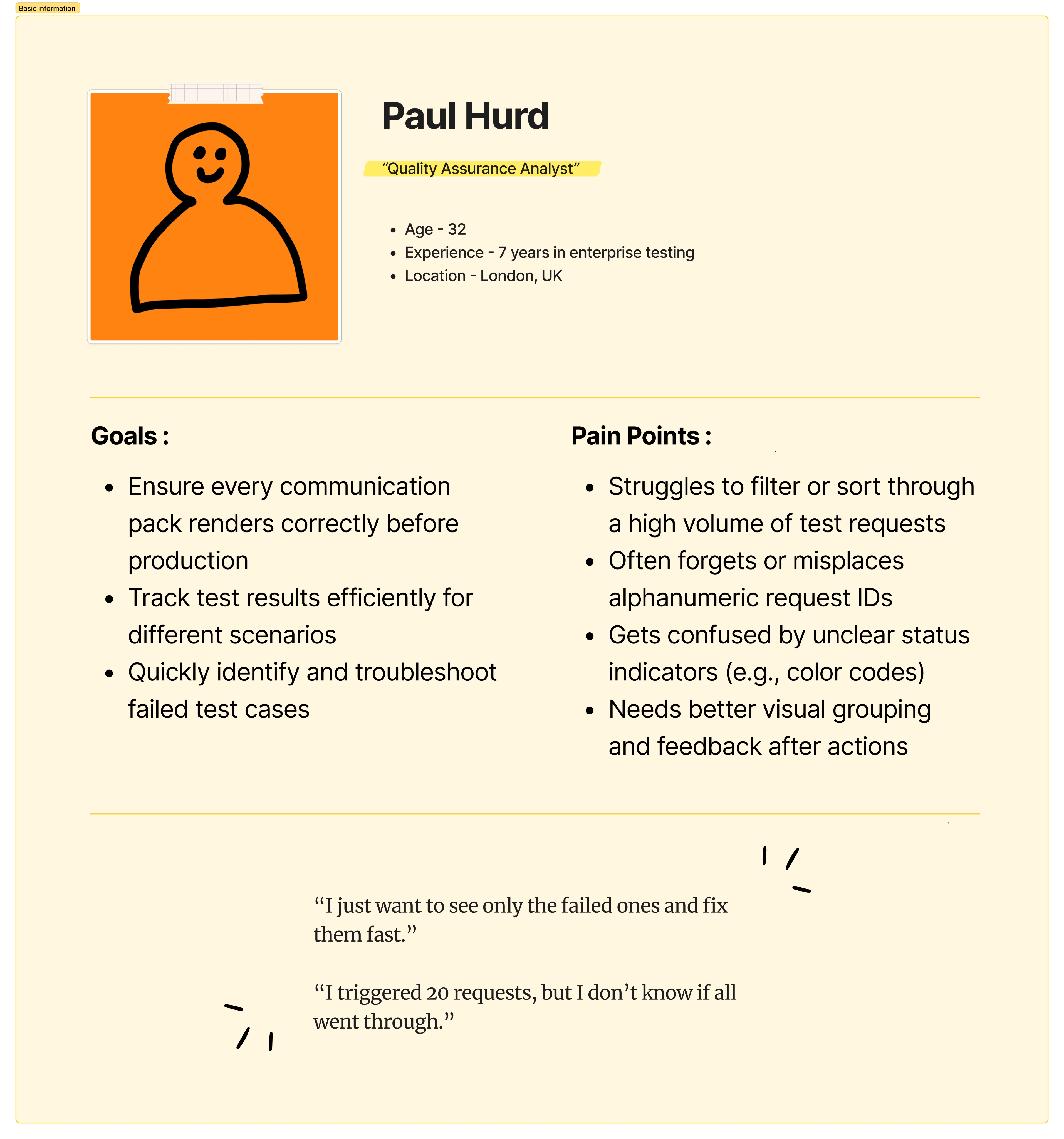
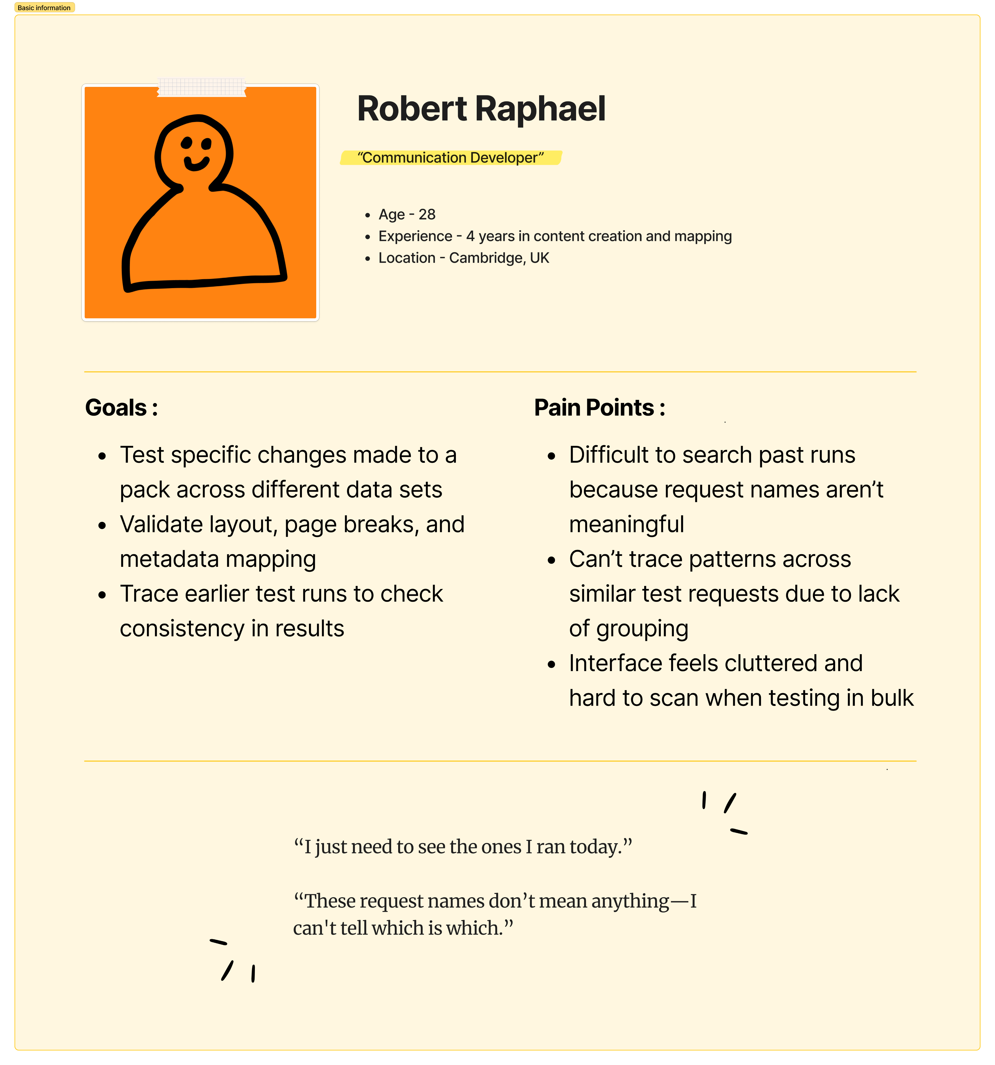
After synthesizing all my research insights through affinity mapping, I needed a way to humanize the data and better understand user behaviors, goals, and pain points.
Creating user personas helped me represent the key user types and keep their needs at the center of the design process.
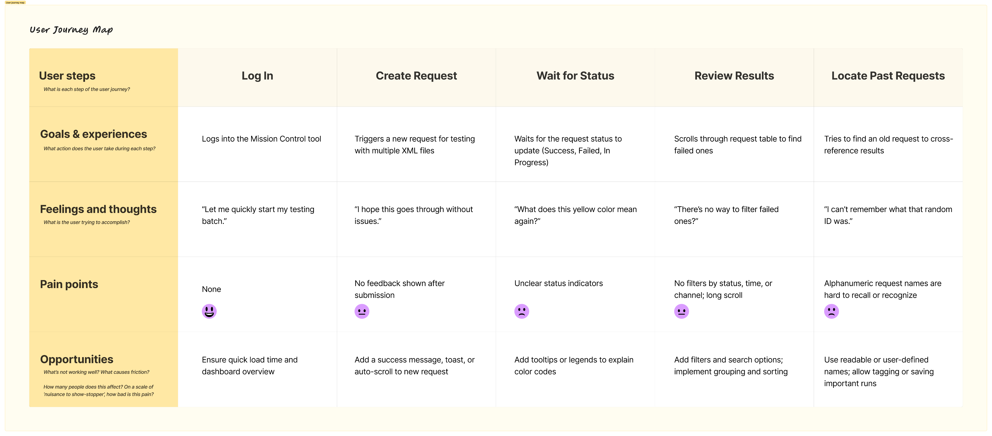
The user journey map then allowed me to visualize their step-by-step experience with the system, uncovering emotional highs and lows, gaps in the flow, and opportunities for improvement
With the user journey mapped out, key friction points became clear — highlighting gaps between user needs and the current system. These insights laid the foundation for defining the core problem this redesign aims to solve.
The following two product goals were identified to guide the redesign and ensure the solution directly addressed user pain points:
Problem Statement
After a key feature in the Mission Control tool was released without UX input, enterprise users testing communications (packs) struggled to navigate and use it effectively, because the interface didn’t align with their workflows—lacking filters, clear entry points, and intuitive structure—leading to confusion and delays during the testing phase.
Goal 1
Improve Request Discoverability and Traceability
Goal 2
Enhance Interface Design to Reduce Cognitive Overload
How might we improve request discoverability and traceability
- Advanced multi-field search
A smart search bar that allows users to search across multiple columns such as request ID, channel, status, application name, or trigger type — not just the request ID.
- Dynamic filtering options
Users can filter requests using a combination of fields — such as Status + Channel, or Application + Date — to quickly drill down to the exact subset of data they need.
- Date and Time selector
Enables users to filter requests within a specific date and time range.
- Request grouping feature
Users can group and save frequently tested request patterns. These groups could be based on similar triggers, applications, or test types, allowing faster batch testing and easier navigation.
- Saved views or presets
Allow users to save custom filter combinations and group selections as named views for future reuse — e.g., “Failed Requests - Email Channel”.
How might we enhance interface design to reduce cognitive overload
- Redesigned, flexible table component
Replace the traditional table with a more adaptable component that supports complex datasets.
- Expandable rows for secondary data
Introduce expandable/collapsible rows to show or hide secondary details (e.g., errors for failed request, files generated).
- Improved color coding with labels
Use meaningful color codes combined with textual labels for action statuses (e.g., Failed, In Progress, Success) and request priorities.
- Whitespace and visual hierarchy improvements
Introduce appropriate spacing, consistent font sizes, and clear sectioning to reduce visual clutter. Use dividers, hover states, and iconography to guide user attention.
- Column customization and visibility toggle
Allow users to customize which columns are visible to suit their role or task. For example, testers might want to see "Trigger Type" while developers may prioritize "Response Code."
Click here to view the Affinity Diagram
*
*
*
*
Discover
Define
Design
Deliver
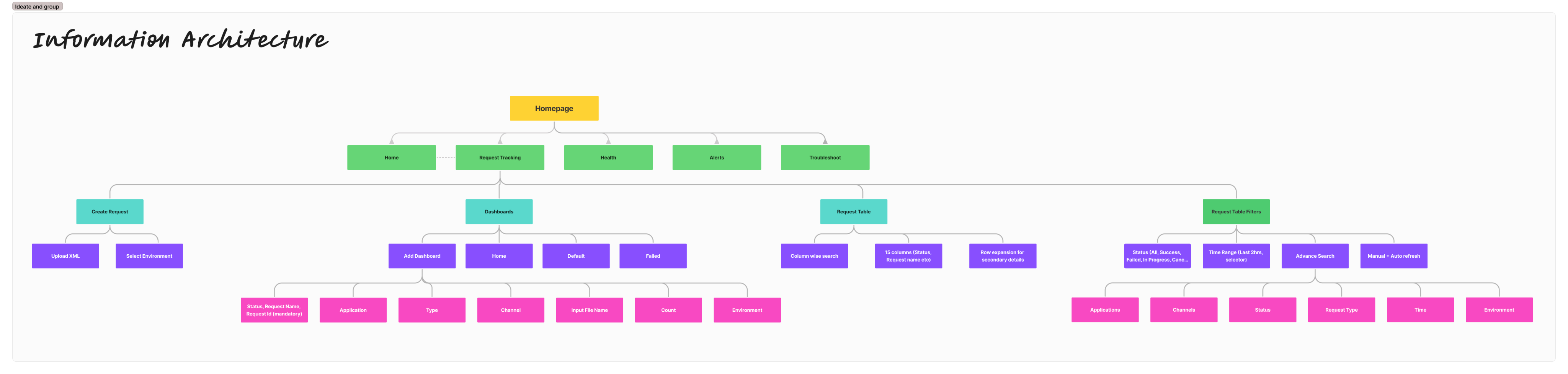
Information Architecture
To design the information architecture, I began by aligning it closely with the key product goals identified earlier.
Improving request discoverability and traceability
I ensured that features such as multi-field search, advanced filtering, and a date/time selector were placed prominently within the second or third level of the information architecture. For users who regularly revisit certain types of requests, I introduced the concept of custom dashboards. These dashboards can be created based on specific filters or parameters, allowing users to group and monitor requests more meaningfully.
Enhancing interface design to reduce cognitive overload
Once users locate the relevant requests, the next challenge was to make the data easier to read and interpret. To support this, I designed a more concise column layout and introduced an expandable row pattern. This lets users scan the key data at a glance, while still having access to deeper request details without being overwhelmed by horizontal scrolling or dense layouts.
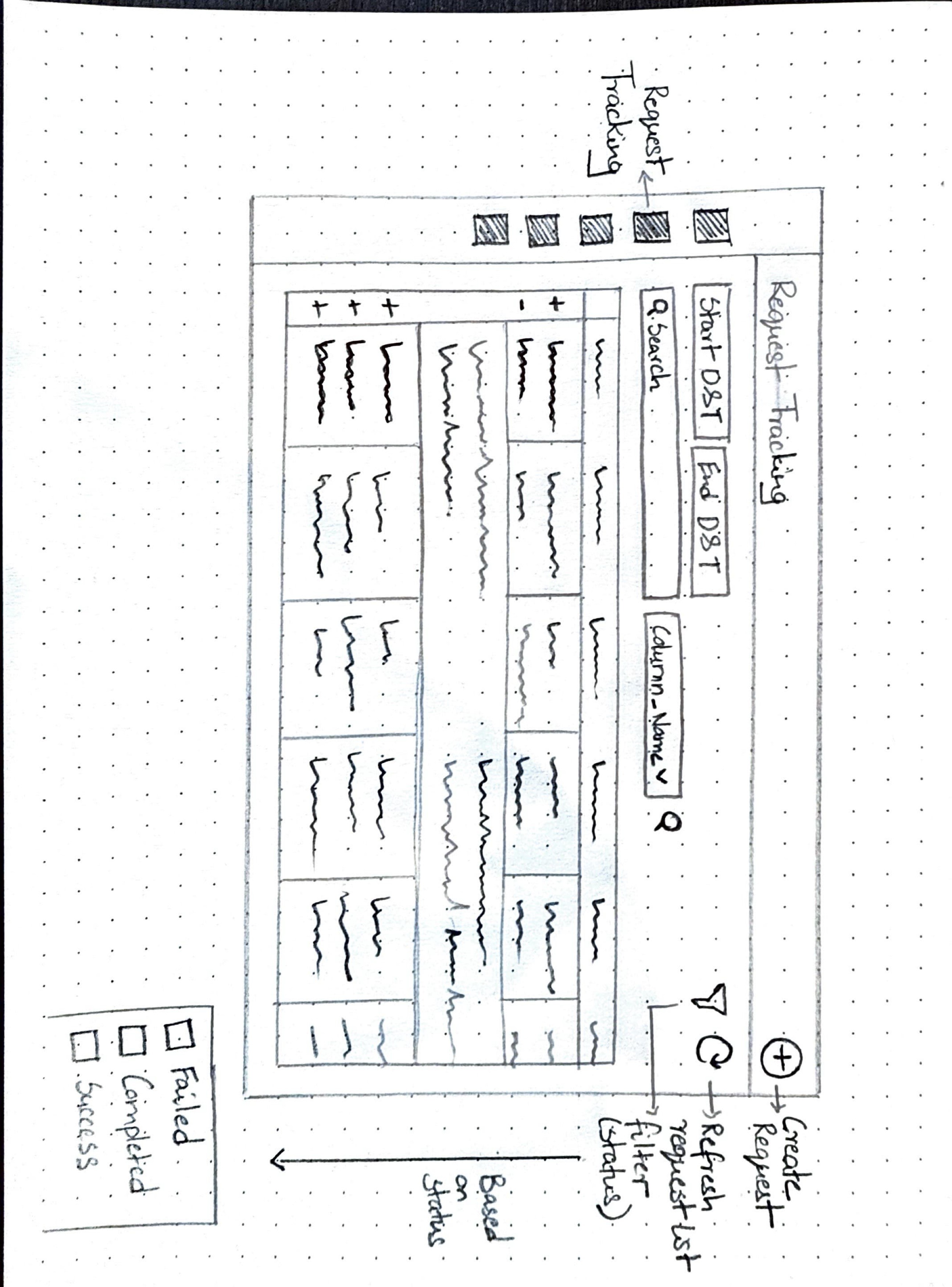
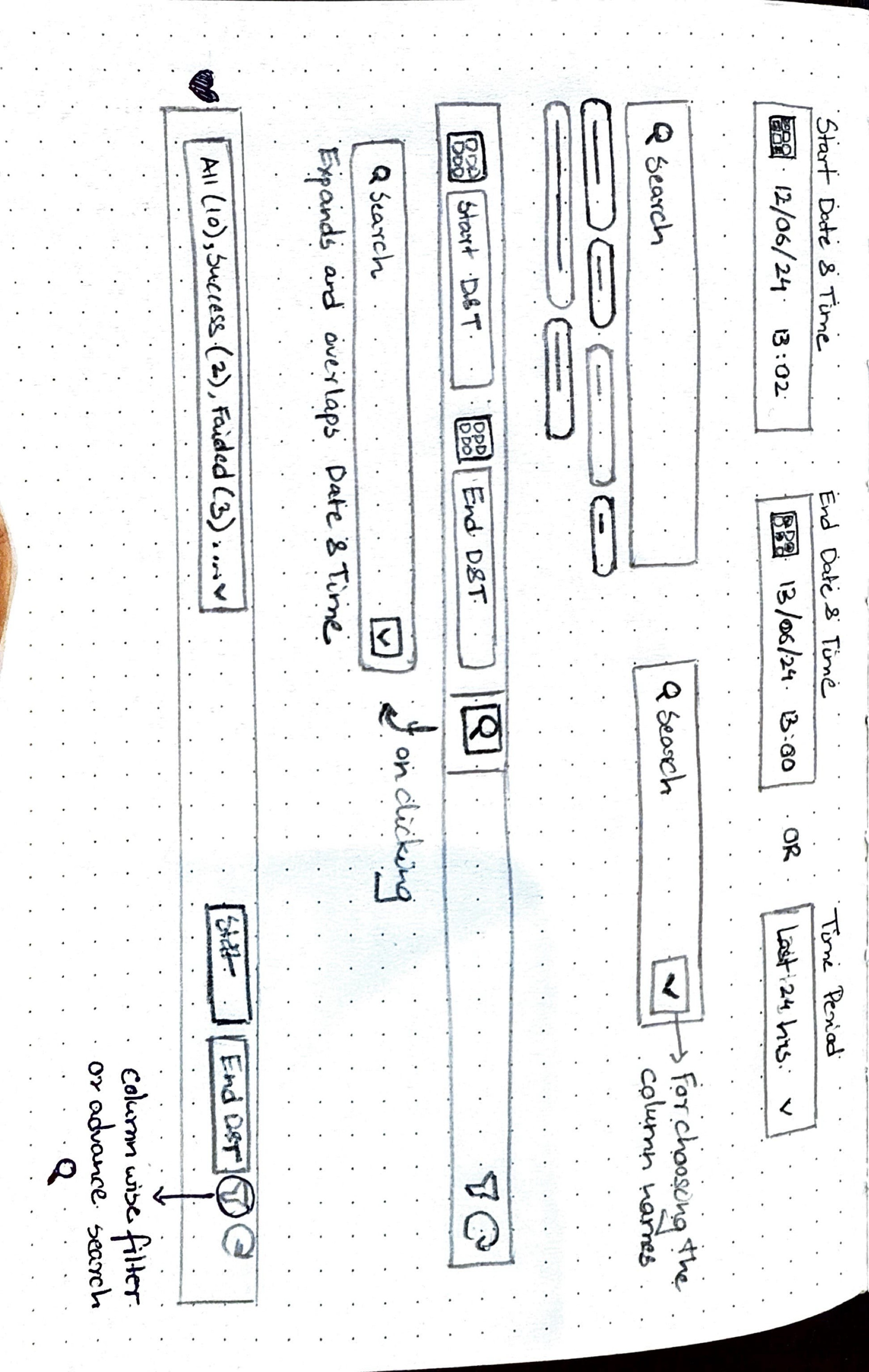
Sketches
Before finalizing the design, I sketched out a few screen variations to explore how best to incorporate the key features outlined earlier. However, given the urgency of the situation—this was a live product that had already been deployed and had experienced significant issues—we had limited time for multiple design iterations. A substantial amount of time had already been invested in research, and the team needed a quick turnaround.
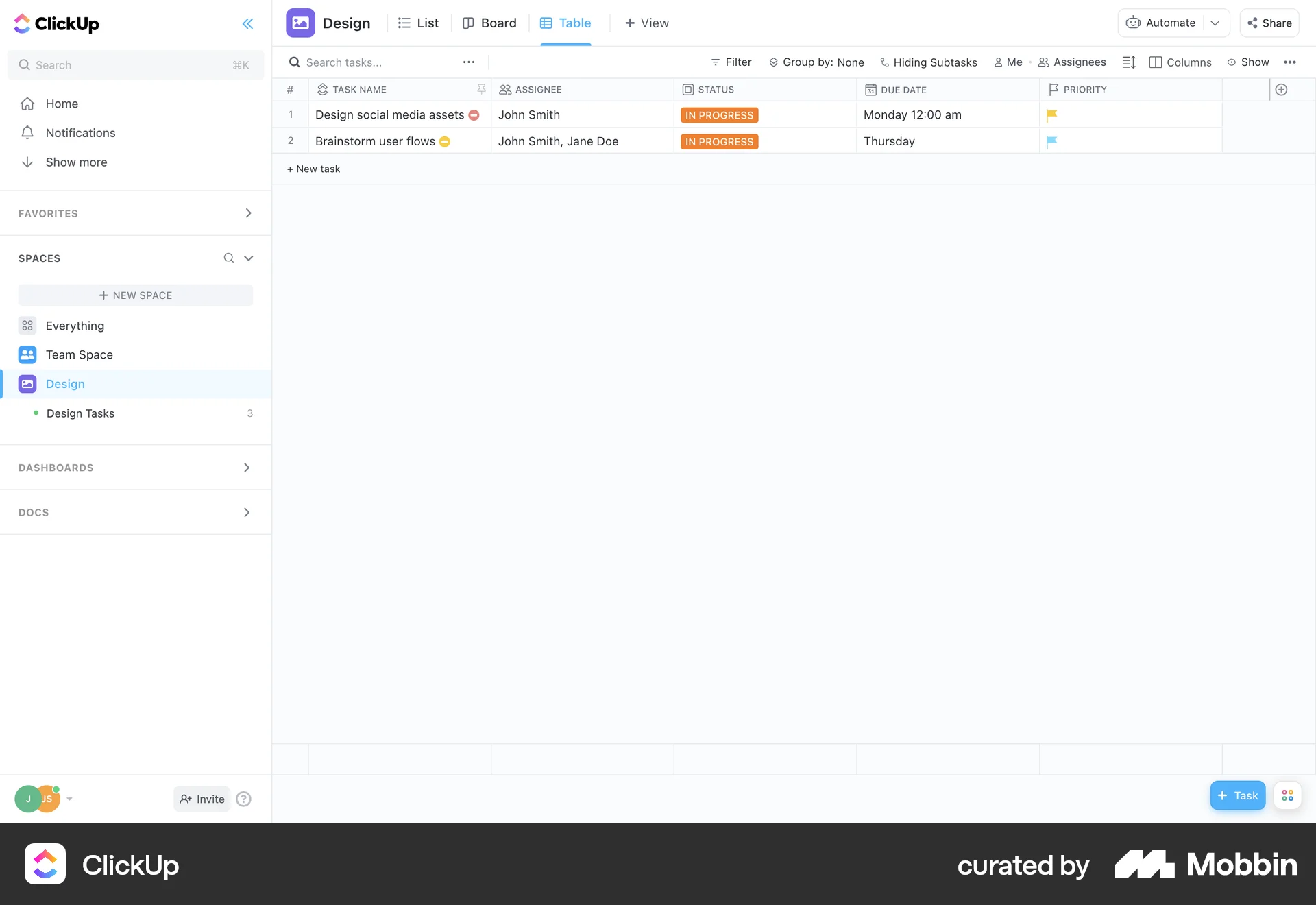
After completing the sketches, I was still uncertain about the table component. Initially, I was hesitant to modify the existing table, thinking that retaining it would significantly reduce engineering effort and speed up delivery. However, I wasn’t entirely confident that the current table structure could accommodate all the features I had envisioned. To gain more clarity, I decided to explore design inspirations on Mobbin to see if anything resonated or sparked new ideas. Here are a few references that influenced my thinking.
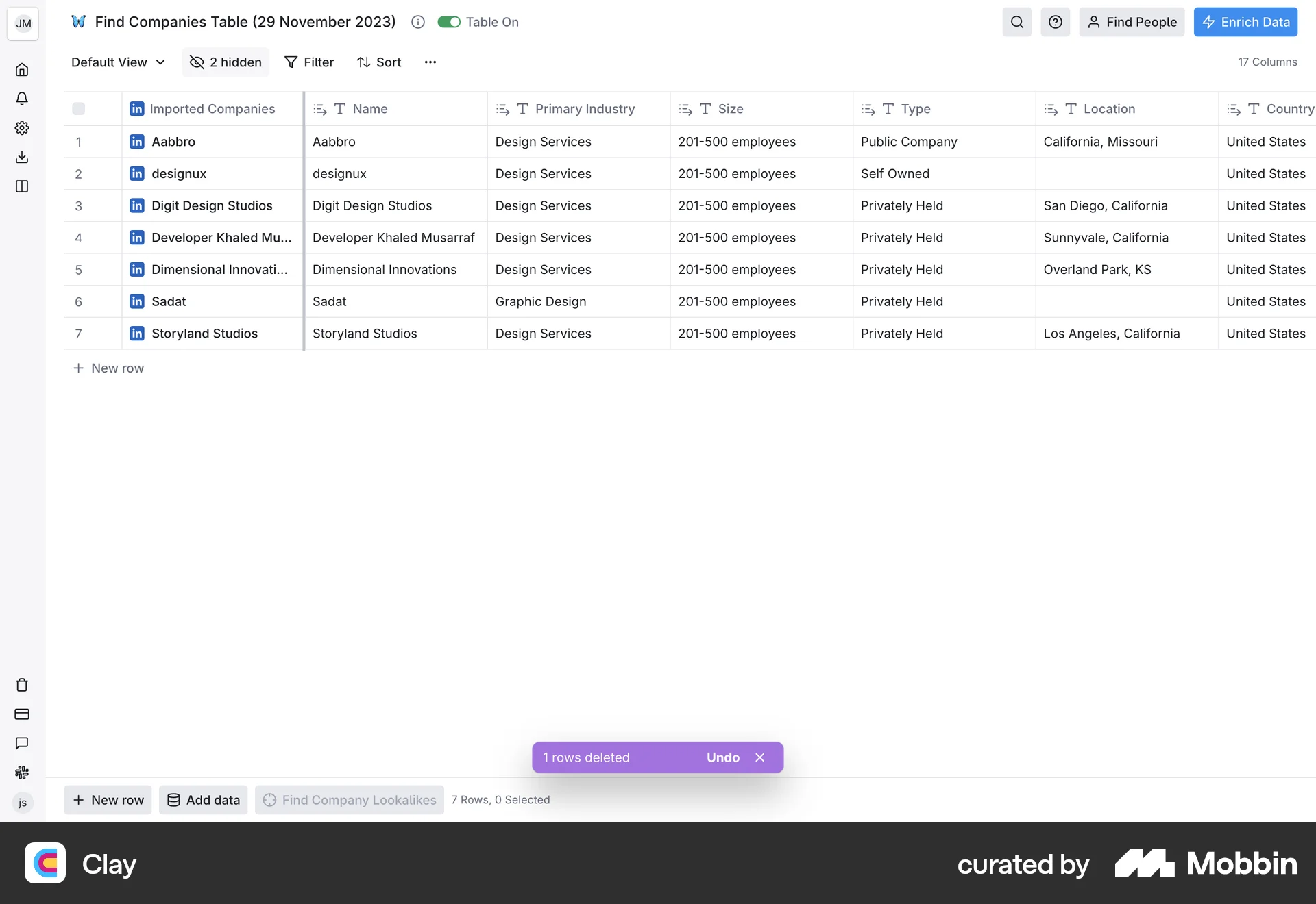
Why not have search against
all columns?
Cell structure for the table to clearly segregate large
chunk of data


Since the problem areas were well-defined and I felt confident in the design direction, I decided to move directly to high-fidelity designs to accelerate the redesign process without compromising on quality.
*
*
*
*
Discover
Define
Design
Deliver
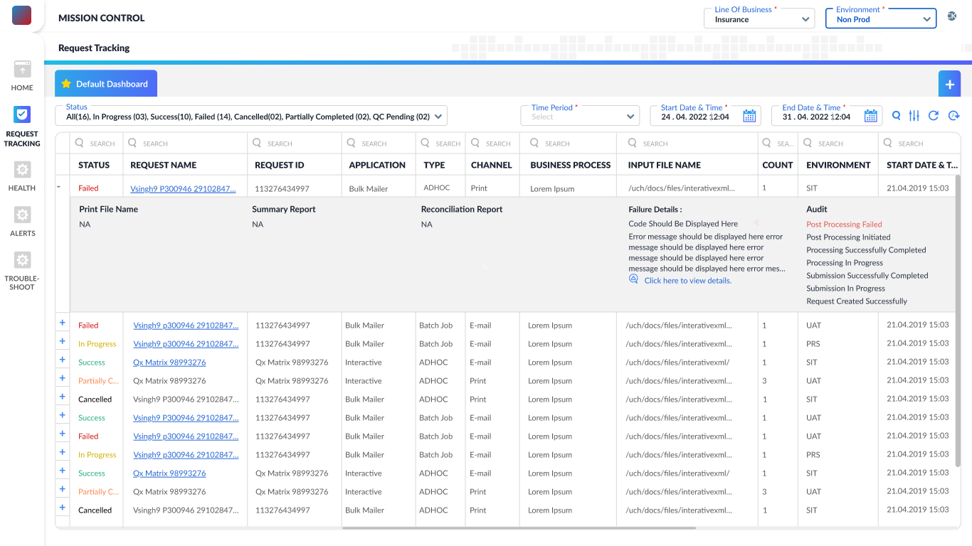
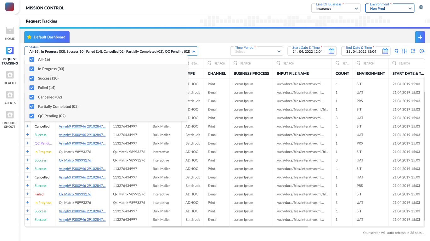
The redesigned landing page simplifies request management with default and customizable dashboards, advanced search, and time/status filters. Manual and auto-refresh options ensure real-time updates. A cleaner table layout with icons, clear labels, and inline actions helps users quickly scan, identify, and manage requests—making testing faster and more efficient.
The redesigned expandable row view minimizes horizontal scrolling by nesting secondary information within the same row. Users can now access detailed data without navigating away or losing context. This layout enhances readability, reduces cognitive load, and streamlines decision-making—especially useful when scanning through multiple requests during testing or troubleshooting.
To make request counts more intuitive, I replaced plain headings with an interactive status filter. Drawing from research insights, users can now view total requests or filter by status—Success, Failed, etc.—with real-time counts. This improves visibility, prioritization, and control while aligning closely with user needs uncovered during testing.
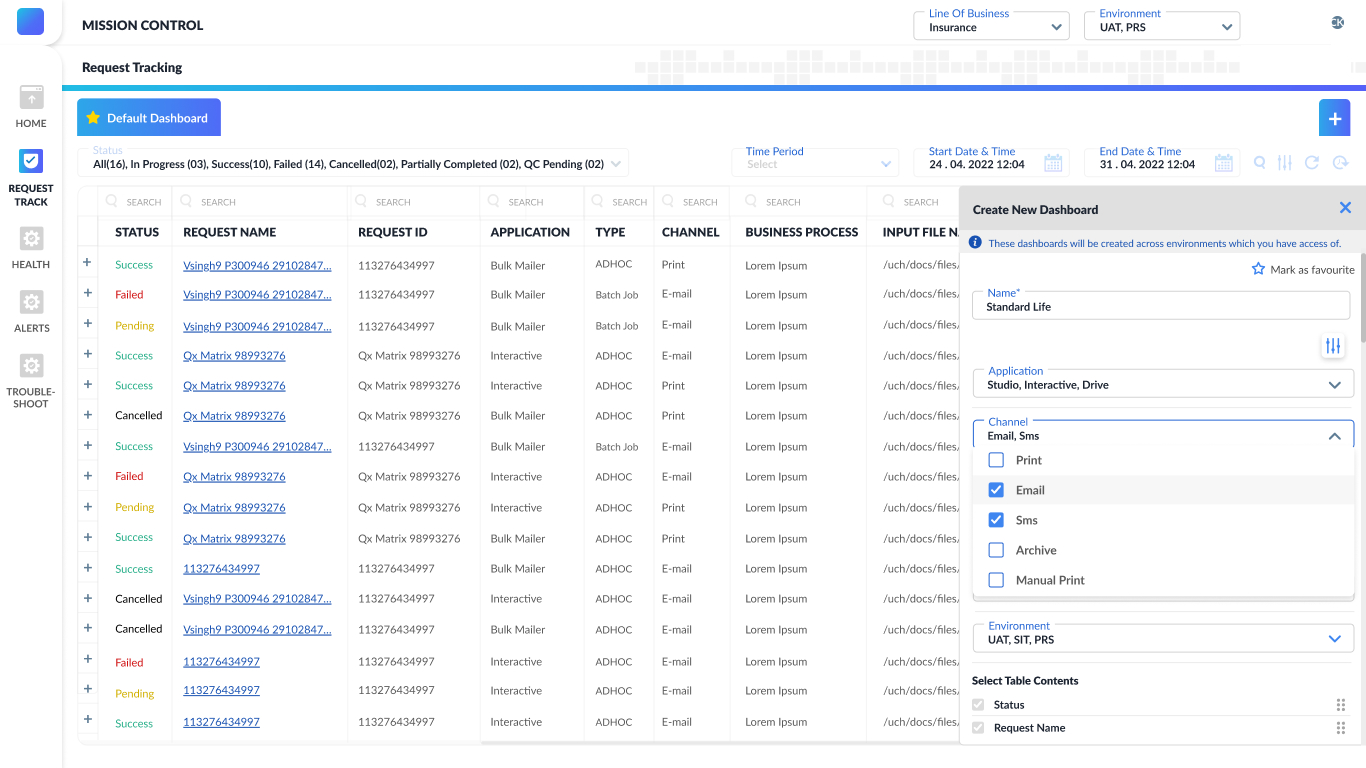
A new modal allows users to create personalized dashboards based on their roles. Instead of relying on default views, users can select relevant columns to track only the information they need. This supports focused workflows, reduces clutter, and gives users greater control over how they monitor their requests.
Post Deployment
- Quick usability testing was conducted with positive feedback.
- Users appreciated the clarity and control in the new interface.
- Post-deployment, several new feature requests came in and were added gradually.
Key Learnings
- Learned to balance speed with research quality under time pressure.
- Understood the importance of designing for scalability (future features).
- Got better at synthesizing insights fast and translating them into actionable UI.
- Improved collaboration with engineering and product teams for quick delivery.
Screens in this case study reflect multiple released versions—minor differences may be observed.
Let’s work together
ux.with.nidhi@gmail.com
Phone Number
07769374695


